How to Style Open Shelves Like a Designer: Proven Tips That Actually Work
You installed beautiful open shelves. Then you loaded them up with books, mugs, candles, and that random souvenir from a trip three years ago. Now they look cluttered instead of curated, and you can't figure out why.
You're not alone. Styling open shelves is one of those things that looks effortless when designers do it - and frustratingly difficult when the rest of us try. But here's the good news: there are actual repeatable techniques behind those perfectly styled shelves you see on Pinterest and in design magazines.
This guide breaks down the specific methods professional designers use to style open shelves, so you can apply them to your own home - no design degree required.
The Rule of Three (and Why Odd Numbers Work)
This is the single most impactful styling principle, and designers use it constantly: group items in odd numbers, preferably three.
Why odd numbers? Our brains process even groupings as "complete" and move on quickly. Odd groupings feel slightly unresolved, which keeps the eye engaged longer. Three items create a triangle shape that adds visual interest without complexity.
Here's how to apply it:
- Vary heights within each group. One tall item (a vase, a candle holder), one medium item (a small plant, a framed photo), and one short item (a decorative box, a small sculpture). The height variation creates a visual "slope" that guides the eye.
- Mix shapes. Combine something round (a bowl, a globe), something rectangular (a book, a box), and something organic (a plant, a piece of driftwood). Different shapes prevent the grouping from looking monotonous.
- Keep a common thread. Even within varied items, one connecting element ties the group together - similar color tones, matching materials, or a shared theme.
You can apply the rule of three at multiple scales: three items in a group, three groups across a shelf, or three shelves in a wall arrangement.
Color Grouping: Creating Visual Harmony
Color is the fastest way to make shelves look intentional versus random. Designers typically use one of three color strategies:
The Neutral Anchor
Start with 70% neutral tones - whites, creams, natural wood, gray, black. Then add 20% of one accent color and 10% of a secondary accent. For example: mostly white and wood items, with sage green accents and touches of brass. This approach works in nearly every room and is the safest starting point.
The Tonal Range
Pick one color family and use varying shades. A shelf styled in different blues , from navy book spines to a powder-blue vase to a teal candle , creates a cohesive look with enough variety to stay interesting. This works well when your room already has a dominant color.
The Monochrome + Pop
Keep everything in one neutral tone (all white, all black, or all natural wood) and add exactly one contrasting item per shelf. A single red book. One yellow vase. A single green plant. The contrast item draws the eye and becomes the focal point of each shelf.
Whichever strategy you choose, step back and squint at your shelves from across the room. If the colors feel scattered or chaotic, remove items that break the pattern. Editing is the hardest part , but it's what separates styled shelves from stuffed ones.

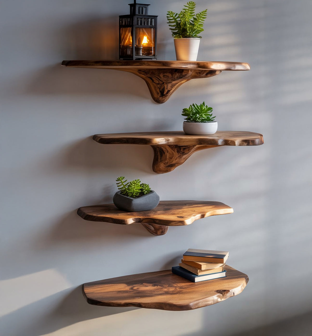
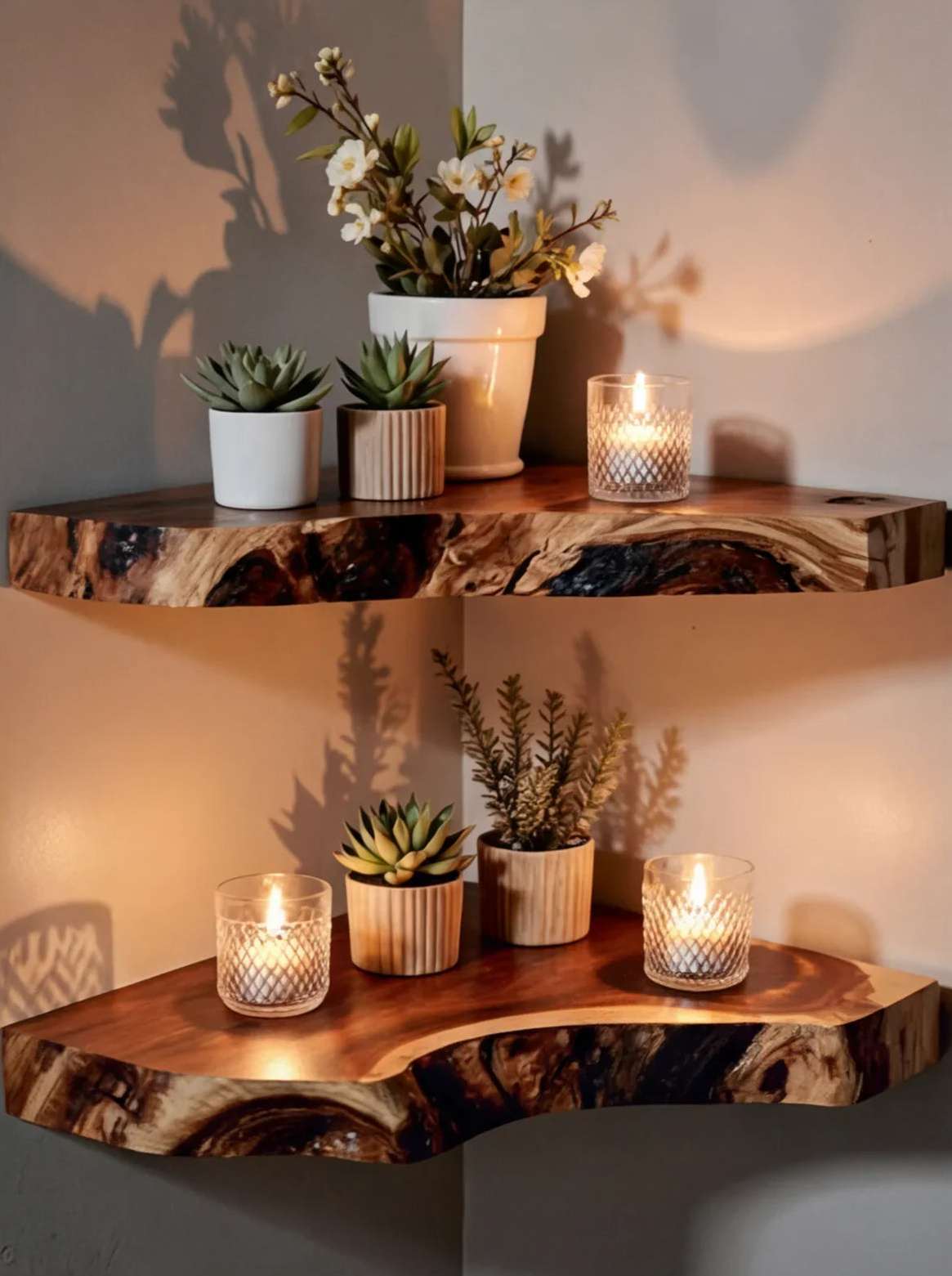
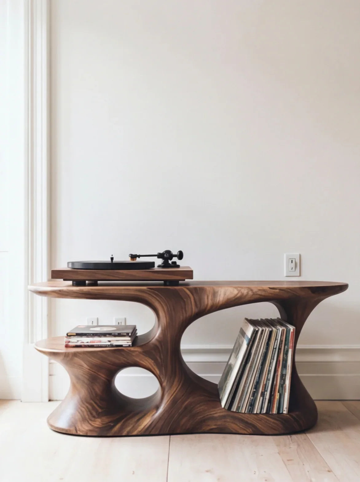
Rustic Floating Wall Shelf with Live Edge - Solid Wood for Home Decor
The Power of Negative Space
Here's the mistake nearly everyone makes: filling every inch of shelf space. Designers do the opposite , they deliberately leave gaps.
Negative space (the empty areas around and between objects) serves several purposes:
- It lets each item "breathe" and be appreciated individually
- It prevents the shelf from looking like storage instead of display
- It creates a sense of calm and order
- It makes the items you do display feel more intentional
A good rule of thumb: leave 30-40% of your shelf surface empty. If that sounds like a lot, you're probably used to overfilled shelves. Try removing one-third of what's currently on your shelves and see how much better it looks.
Where you place the negative space matters too. Leave more space at the edges of shelves and between distinct groupings. The center and front of each shelf should hold your displayed items, while the back and sides should have visible wall or shelf surface.
Balancing Function and Decor
Open shelves in living spaces, kitchens, and home offices need to work, look pretty. The trick is making functional items part of the display rather than fighting against it.
Books as Design Elements
Books are dual-purpose shelf stars. Stand some vertically as a group, lay others horizontally as risers for smaller objects. Remove dust jackets from hardcovers to reveal the cloth covers underneath , they often have more cohesive colors than the printed jackets. Organize books by color for maximum visual impact, or by size for a tidier profile.
Storage Within Display
Baskets, decorative boxes, and lidded containers let you store small items (remotes, chargers, mail, craft supplies) while contributing to the shelf's aesthetic. Choose containers that match your color scheme and treat them as decor objects that happen to hold things.
Everyday Objects, Elevated
Transfer items from ugly packaging into attractive containers. Decant cotton balls into a glass jar. Put pens in a ceramic cup. Store spices in matching containers. The item is still accessible, but it contributes to the display instead of detracting from it.
Layering: Creating Depth on Flat Shelves
A common complaint about open shelves is that they look flat or one-dimensional. Layering solves this by adding depth from front to back.
The technique: place larger, flatter items toward the back of the shelf and smaller items toward the front. Lean a framed print against the wall, then place a small plant in front of it. Stack books horizontally, then set a candle on top. Each layer occupies a different depth plane, creating visual richness.
Specific layering moves that work:
- Art + object: Lean artwork or a framed photo against the wall, overlap the bottom edge with a small decorative object
- Stack + topper: Horizontal book stack with a decorative item on top (a small plant, a crystal, a figurine)
- Tall + short pairing: A tall vase or candlestick behind a shorter item in front creates automatic depth
- Textured backdrop: A woven basket or textured object at the back provides a backdrop for smoother items in front
Keep layers to two or three deep at most. More than that and you lose the ability to see and access back items, turning display into storage.
Texture Mixing: The Secret Ingredient
Color and shape get most of the attention, but texture is what makes styled shelves feel expensive and curated. Mixing different textures , smooth, rough, woven, glossy, matte , creates tactile variety that's visually engaging.
Effective texture combinations:
- Smooth ceramic vase + rough woven basket + glossy book cover
- Matte concrete planter + polished brass accent + natural wood grain
- Glass jar + linen-covered book + terracotta pot
- Velvet-covered box + raw wooden sculpture + metallic frame
The key is contrast. If everything on the shelf has the same texture (all smooth ceramic, for example), the arrangement falls flat. But mixing three or four different textures creates visual interest that makes people want to look closer.
Solid wood shelves themselves contribute to texture mixing. The natural grain of walnut, oak, or ash provides an organic texture that complements both modern and traditional decor items. This is one reason wood shelves style more easily than painted MDF , they bring built-in texture to the arrangement.
Common Styling Mistakes (and How to Fix Them)
Mistake #1: Everything Is the Same Height
Fix: Vary heights dramatically. If your tallest item is 12 inches, include something that's only 3-4 inches. Height variation creates visual rhythm , peaks and valleys that guide the eye along the shelf.
Mistake #2: Too Symmetrical
Fix: Perfect symmetry looks rigid and staged. Aim for approximate balance instead , similar visual weight on each side, but not mirror-image placement. If you have a tall vase on the left, balance it with a stack of books on the right rather than an identical vase.
Mistake #3: No Focal Point
Fix: Each shelf should have one item that draws the eye first , something larger, more colorful, or more unusual than everything else. This anchor item gives the eye a starting point before it explores the rest of the shelf.
Mistake #4: Ignoring the Shelf's Surroundings
Fix: Your shelves exist within a room. Consider the wall color, adjacent furniture, and overall room style when choosing display items. Shelves that look great in isolation but clash with the surrounding decor still fail in context.
Mistake #5: Never Editing
Fix: Styled shelves need periodic editing. As you accumulate new items, remove old ones. Rotate seasonal decor. A shelf arrangement that looked great six months ago may need refreshing , and that's normal.

A Quick Shelf-Styling Formula You Can Follow
If all these principles feel like a lot to juggle, here's a simplified formula you can apply to any shelf:
- Start with one anchor piece , something tall or visually dominant (a vase, a plant, a piece of art)
- Add a book stack . 2-3 books, either horizontal or vertical, near the anchor
- Place a small organic element , a plant, a piece of coral, a wooden bowl
- Include one functional item , a clock, a candle, a small box
- Leave 30% empty , resist the urge to add more
Repeat across each shelf, varying the position of the anchor piece (left on one shelf, right on the next) to avoid a repetitive pattern. Step back, squint, edit. Done.
Choosing the Right Shelves for Styling
The shelf itself sets the stage for everything you put on it. A few things to consider:
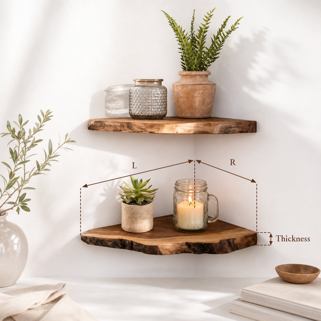
- Depth matters. Shelves that are too shallow (under 6 inches) limit your layering options. Shelves that are too deep (over 14 inches) make items look lost. For most styling purposes, 8-12 inches provides the sweet spot.
- Material shows. The visible edge of the shelf is part of the display. Solid wood edges with natural grain add warmth. Painted MDF edges look clean but can chip over time. Choose a material that complements your decor items.
- Length creates opportunity. Longer shelves (36-48 inches) allow for multiple groupings with negative space between them. Short shelves (12-24 inches) work well for tight spaces but may only accommodate one grouping each.
Solid wood floating shelves give you a styling advantage because their natural texture and warmth complement almost any decor palette. And corner floating shelves offer an often-overlooked opportunity to add display space in rooms where wall space is limited.
Frequently Asked Questions
How do I style open shelves without looking cluttered?
Follow the 30% empty rule , leave at least a third of the shelf surface visible. Group items in clusters of three with space between groups. Remove anything that doesn't fit your color scheme or doesn't have a purpose (functional or decorative) on the shelf.
What should I put on open shelves?
Mix functional and decorative items. Books, plants, candles, framed photos, decorative boxes, small sculptures, and ceramics all work well. The key is variety in height, shape, and texture. Avoid putting purely utilitarian items (random mail, keys, chargers) on display shelves.
How often should I restyle my shelves?
A full restyle every 3-6 months keeps things fresh. Seasonal swaps (switching candles, changing out a plant, rotating artwork) can happen more frequently. If you walk past your shelves without noticing them, it's time for a refresh.
Should open shelves match the room's furniture?
The shelves should complement the room, but they don't need to be an exact match. A warm-toned wood shelf in a room with cool-toned furniture can work beautifully as a deliberate contrast. What matters most is that the items on the shelves connect visually to the broader room.
How do I style open kitchen shelves differently from living room shelves?
Kitchen shelves lean more functional , everyday dishes, glassware, and cooking ingredients can all be display pieces. Group by category (all white dishes together, matching jars in a row) and keep frequently used items at the most accessible heights. Living room shelves prioritize aesthetics with function as a secondary concern.
Style With Confidence
Styling open shelves isn't about having expensive decor or designer taste. It's about applying a few reliable principles , odd number grouping, color cohesion, negative space, layering, and texture mixing , and then editing ruthlessly until it feels right.
Start with quality shelves that look good even empty. At Ashdeco, our open shelves are handcrafted by skilled Vietnamese artisans from solid wood, so the shelf itself becomes part of the design. Natural wood grain, clean lines, and sturdy construction give you a foundation that makes styling easier from the start.
Ready to build your styled shelf display? Explore our floating shelf collection or check out our corner shelves for creative placement ideas.


