How to Style a Sideboard: The Layout That Doesn't Look Cluttered
How to style a sideboard is really two questions people mix up: what goes on top, and what goes above it on the wall. Get either one wrong and the piece reads as either bare and unfinished or cluttered like a display table at a home goods store. A sideboard already has visual weight - a long, solid cabinet holds attention on its own. The styling job is to add just enough on top to feel intentional, without competing with the cabinet itself.
As a handmade furniture brand that builds sculptural, hand-carved sideboards, we see people under-style a beautiful door front (nothing on top, looks unfinished) or over-style a plain one (twelve small objects, looks like a garage sale). Neither works. Here's the layout that does.

The Core Rule: Grain Is the Decoration
A solid wood sideboard already has texture, grain, and often a sculptural door front doing visual work. The styling on top should support that, not compete with it.
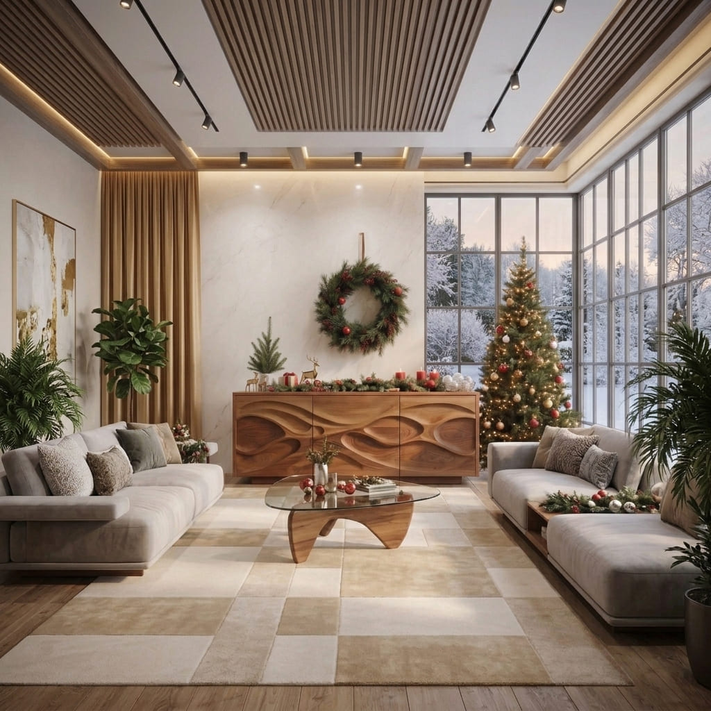
If the cabinet has a carved or sculptural front (like our rustic wooden sideboard with undulating doors or hand-carved credenza with sculpted doors), keep the top minimal. The wood is already the statement. Two or three objects, mostly negative space.
If the cabinet has plain, flat doors, the top can carry a bit more visual interest - a taller vignette, more layering - since the cabinet itself isn't asking for attention.
Either way: less than you think. A sideboard with too much on top looks like storage that ran out of room, not styling.

The Rule of Three (and Odd Numbers Generally)
Group objects in odd numbers - three, five - not even numbers. Two items look like a matched pair searching for a third. Four looks accidental. Three or five reads as composed.
A basic three-object formula that works on almost any sideboard:
- One tall anchor - a vase, a sculptural object, a stack of books with something small on top
- One medium piece - a bowl, a smaller vase, a framed photo leaning (not hanging) against the wall
- One low, horizontal element - a tray, a low dish, or a short stack of books lying flat
Vary the heights. If everything on the sideboard is the same height, it reads as a retail shelf display, not a considered room. A tall-medium-low rhythm is what makes three or five objects look deliberate instead of random.

Layering Front to Back
Depth does real work here. Instead of lining objects up in a single row facing forward, layer them:
- Taller pieces (a vase, leaning art, a sculptural object) go toward the back, closer to the wall
- Shorter pieces (a small bowl, a candle, a stack of coasters) come forward, in front of the taller pieces
This creates visual depth even on a sideboard that isn't very deep, and it photographs better because nothing blocks anything else. It also mimics how a stylist would set a table - not everything facing the same direction, at the same height, like soldiers in a row.

What to Actually Put on a Sideboard
A lamp, or a pair of smaller lights. If the sideboard sits in a living room or entry with limited overhead light, this is functional, not just decorative. One lamp is usually enough - a pair only works if the sideboard is long enough (55"+) that two lights don't crowd each other.
One tray or bowl. Corrals smaller items (keys, coasters, a candle) so the top doesn't collect visual clutter over time. This is the single easiest fix for a sideboard that's slowly become a catch-all.
One vertical element. A tall vase with branches, a sculptural wood piece, or a stack of books with a small object resting on top. This is your anchor - the tallest thing on the surface.
Something organic. A small plant, dried branches, or a bowl of something textural (pinecones, stones). This softens the hard lines of a wood cabinet and keeps the vignette from feeling too staged or symmetrical.
What to skip: five candlesticks in a row, a wine rack plus a picture frame plus a plant plus a bowl - anything that turns the top into an inventory of unrelated objects. If you can't explain why each object is there, remove it.

What Goes Above the Sideboard
The wall above the sideboard is part of the same composition, not a separate decision.
One mirror or one art piece, wider than a postage stamp but narrower than the cabinet itself. As a rough guide, the art or mirror should be roughly 2/3 to 3/4 the width of the sideboard below it - wider looks like it's floating off the edges, narrower looks lost.
A gallery of 2-3 coordinated frames works if you want more visual interest than a single piece, but keep the frames similar in style (same finish, similar mat width) so it reads as one composition, not a random collection.
Height: center the art or mirror roughly 6-10 inches above the sideboard top. Too close and it feels cramped; too far and the two elements stop reading as a pair.
If the sideboard sits in a dining room and doubles as a buffet, keep the wall art simple - it's a background element during dinner, not the focal point. In a living room, where the sideboard is a permanent fixture people see daily, the wall piece can carry more weight.

Styling by Room
Dining Room Sideboard
Keep the top mostly clear during regular use - it needs to function as serving space. For everyday styling: a table runner or single tray, one low centerpiece (candles, a small arrangement), and that's it. Save the fuller vignette for when the sideboard isn't doing double duty as a buffet.
Living Room Sideboard
This is where the fuller three-to-five-object styling makes the most sense, since the top isn't needed for serving. A lamp, a stack of books, a sculptural object, and a plant is a solid living-room formula. See our sideboard dimensions guide if you're still deciding on the piece itself before you get to styling it.
Entryway Sideboard
Function first: a tray for keys and mail, then one or two decorative objects. A mirror above is almost always the right call in an entry - it adds light and a last-look moment before heading out.

Seasonal Styling Without Starting Over
A sideboard is one of the easiest surfaces to refresh seasonally without redoing the whole layout:
- Swap the "organic" element (branches, greenery) for the season
- Change the tray or bowl contents (candles for winter, a bowl of citrus or greenery for spring/summer)
- Keep the anchor piece (vase, sculptural object) as the constant - it's your base layout, and everything else rotates around it
This is far less work than restyling the entire top from scratch every few months, and it keeps the core composition consistent.
Common Sideboard Styling Mistakes
Nothing on top. A bare cabinet, especially one with a plain door front, looks unfinished. Even one well-chosen object changes this.
Everything the same height. Five items at roughly the same height reads as a product shelf. Vary height deliberately.
Matching sets. A pair of identical candlesticks plus a pair of identical frames looks like a hotel lobby, not a lived-in room. Mix shapes, materials, and heights.
Overcrowding a sculptural front. If the cabinet itself has carved doors or strong grain, a busy top competes with it instead of complementing it. Pull back.
Art or mirror too small (or too large) for the cabinet. A tiny frame above a 65" sideboard looks lost. A mirror wider than the cabinet looks like it doesn't belong to that wall. Stay in the 2/3 to 3/4 width range.
Ashdeco Sideboards Built to Be Styled, Not Just Filled
Every Ashdeco sideboard is solid hardwood, hand-carved or sculptural where the design calls for it - meaning the piece itself is already doing visual work before you put anything on top. That's why less is usually more here: pieces like the sculptural organic wave sideboard or rustic wooden sideboard with undulating doors are meant to be seen, not buried under a dozen small objects.
Browse the full range in our sideboards collection.
FAQ
What should you put on top of a sideboard?
A small, odd-numbered grouping works best: one tall anchor piece (vase or sculptural object), one medium item (bowl or leaning frame), and one low horizontal piece (tray or stacked books). Vary the heights and leave visible negative space.
How do you style a sideboard without it looking cluttered?
Limit yourself to 3-5 objects, group in odd numbers, vary height, and layer front to back rather than lining everything up in a single row. If the cabinet has a carved or sculptural front, style even more minimally.
What size art should go above a sideboard?
Roughly 2/3 to 3/4 the width of the sideboard, centered, with about 6-10 inches of space between the top of the cabinet and the bottom of the art or mirror.
Should a sideboard be symmetrical or asymmetrical when styled?
Asymmetrical, generally. Odd-numbered groupings with varied heights read as more intentional and less staged than a perfectly symmetrical, matched arrangement.
How often should you restyle a sideboard?
You don't need to overhaul the whole layout often. Keep one anchor piece constant and rotate smaller seasonal elements (greenery, tray contents) every few months for a quick refresh.
A sideboard earns its keep as furniture first. Style it like you'd finish a good piece of writing - say only what needs to be said, and let the wood do the rest of the talking.